My 5-step process for goal-oriented data visualizations using charts
For most of us software developers, visualizing data in charts isn’t something we do daily, but we’ve all had (or will have) to do it at some point. Whether it’s visualizing data for the business, or visualizing metrics of the systems we want to monitor.
A common “process” might be: we take our preferred charting tool, select a line-chart, create a basic query to get a hold of the data, maybe a little fiddling with the chart’s legend or colors to make it look nice and shiny…and we’re done! That was easy!
A few weeks later, during a water cooler chat, we ask some users if they’ve already used the shiny new chart, eagerly awaiting the positive feedback. Turns out most of them looked at the chart initially, but haven’t used it since. So you ask them why. Some say the chart was confusing, others say that they couldn’t easily see the data they needed for their job (“but it’s right there!” you think).
However, one person kept using the chart daily to make decisions. Aha, you think, one glorious soul who has recognized the power of my shiny new chart! However, as you ask more questions about how they’ve been using the chart, it becomes glaringly obvious that they’ve been deriving the wrong conclusions from reading the chart. This is even worse than not using the chart at all!
Dumping data into a chart is easy. Visualizing data effectively in a chart is hard.
As you’ve probably noticed already, charting data such that it is a reliable source for decisions isn’t always as easy as it looks. Whether you’re charting metrics or business data, there are always a couple of best practices you need to apply and steps you need to go through to make a good chart.
- who is the target audience?
- why would they need the chart? What are the conclusions they want to draw from it?
- what would be a good visualization communicate the data effectively, taking the targeted conclusions in mind?
- do we need to aggregate or transform the data differently to serve our visualization?
- verify the charted results with the raw data
We’ll go into each of these topics one-by-one.
Sample scenario
First, let’s setup a scenario to make this a more practical exercise. Assume we are working in a company which tries to optimize traffic. They deployed measuring devices/sensors on various roads to gather usage data. By now, they’ve gathered data for multiple months. They give you the task of visualizing this data.
Every captured data point has the following information:
- timestamp of the measurement
- sensor name (also indicates location)
- type: car, bicycle, pedestrian
The target audience & use-case
Creating a good chart always starts with knowing who will use the chart and what they want to use it for. What are the decisions they want to make? Are there multiple audiences and purposes for the data?
In our scenario, we appear to have two audiences and use-cases for this data:
- traffic analysts: they want to use this data to, on a daily and hourly basis, steer the traffic in a semi-intelligent (but not fully automated) way. For example, when a sensor near a school reports that between 8-9am the number of pedestrians reaches a certain threshold, then they’ll configure the dynamic traffic signs with a schedule to reduce the allowed speed for cars to 30km/hour during that time period.
- government traffic agency: they want to report on the long-term evolution of various kinds of transportation. Is bicycle usage rising after a year-long campaign to encourage citizens? What are the monthly figures telling us?
These are clearly two different audiences with different goals, so they are probably best served with their own visualizations. We’re continuing with the use-case of the traffic analysts.
Designing a good visualization
Before we chart the data, we should think about which visualization might best help with achieving the goals of the chart. I recommend creating a mockup as it allows you the experiment and quickly iterate on the visualization. I use Balsamiq, a generic mockup tool without all the bells and whistles of a real charting tool, so less distraction.
How not to chart data
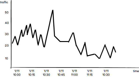
If we would’ve just dived in without answering the previous question of audience and purpose, we might come up with a chart as shown below. It’s a simple count of all transportation types and locations combined in a single line chart, using the default 5-minute interval as provided by our charting tool.
Not a lot of thought went into this visualization and therefore it doesn’t answer any of the questions our traffic analysts are interested in.
Improving the visualization step-by-step
So now let’s put some thought into this visualization. The first thing we need to improve is the interval. The analysts were interested in the hourly aggregates on a daily basis. Maybe a vertical bar chart is better for this, so that we have a bar for all 24 hours in a day.
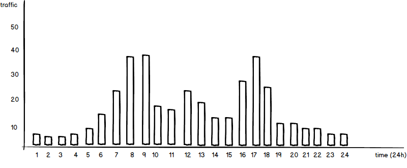
From this chart, our analysts can already derive the peak hours of traffic globally. It’s an improvement, but we’re not there yet.
The next improvement would be to visualize the transportation types and how they compare to each other over this 24-hour period. We should also add a legend, to clearly show which color represents which transportation type.
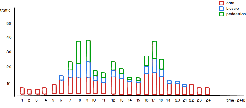
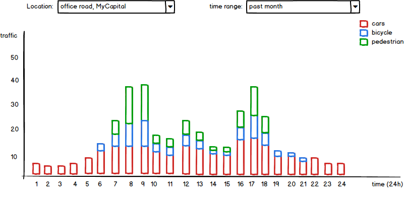
From this chart, our analysts can now clearly see when pedestrians and bicyclists are more active. That’s another step in the right direction! However, the data being shown now is for all locations, while our analysts want to optimize the traffic on a per location basis. Let’s assume, for this example, only 10 locations. We might add a filter to the chart, so that our analysts can easily select the location. While we’re at it, we might as well add a time range filter, so that they can show the data of the last week, month or year.
Cool, our chart looks almost perfect. But our analysts want to have a view on every day of the week, while our current chart aggregates all days of the week into one chart. This is something we could solve with an extra weekday filter, but then our analysts have a harder time to compare the weekdays as they can only see one day at a time. So given that the number of days in a week is hard limited to 7 days, why not show all 7 days at once in a proper dashboard?
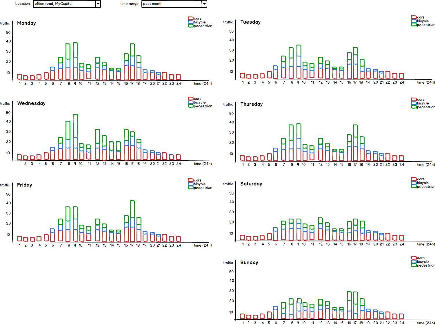
Now our analysts can easily compare the traffic between days, it’s exactly what they need!
Let’s have a look now at some decisions that we took for granted in this example.
Which kind of chart to use?
Choosing the right chart is all about knowing the options, as there are more than you would expect. You probably know the standard line, bar and pie chart. These are also the ones you will probably use the most, but they aren’t ideal for every use-case. Also, don’t forget that you can stack and combine them!
But let’s have a look at some other, less common, interesting visualizations you’ll encounter or might need as a developer.
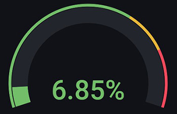
The gauge chart
This chart is used to show the current usage, either absolute or percentage-based. In many gauge charts, you can also configure multiple thresholds, each with their own color. Ideal if you want to visualize the current cpu usage.
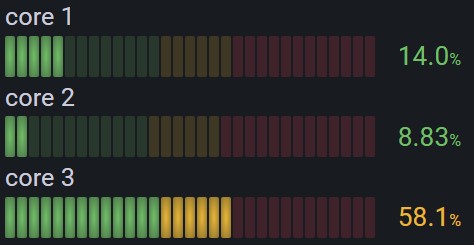
But what if you have a series of cpu cores? Then the Bar Gauge chart can come in handy.
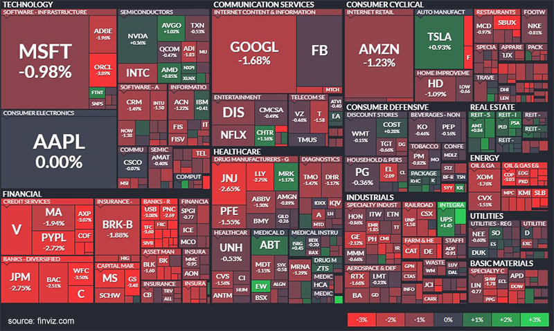
The heat map chart
This is a really powerful chart to show a performance comparison. It uses color to compare the different entries, making it very easy for users to spot outliers. The heat map below is one such example, of which the interactive version is even more interesting on the Finviz site. It smartly uses a standard heat map while also using size to show the weight distribution of the stocks.
The flame chart
The industry primarily uses this visualization for performance profiles. For example, on cpu or memory usage. You can easily identify the most common entries (methods, objects, …) from a hierarchical view.
Scale of a chart
Before we finish up this section, I also want to touch upon the most common scales for a chart and when to use them.
Linear scale
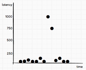
By far the most common scale were all axes are, well…linear. Each step on the axis is a fixed increase compared to the previous step. This scale is good if your values have a limited range, or if you care little about the smaller or larger values in the range.
Logarithmic scale
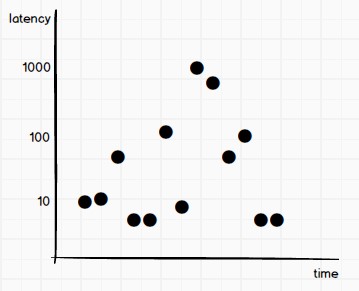
Notice that on the chart below, the data points are the same as on the linear scale. But you can now see more detail for those data points with a lower latency, because they are not being squished by the larger ones. This is because we’re using a log(10) scale. A fixed factor (typically 10, but another less common factor is 2) multiplies each step on the axis. Therefore, the logarithmic scale is more useful when you have a large range of values.
Steps to create a good visualization
So let’s summarize:
- choose your chart type based on the data and its purpose: line chart, bar chart, stacked bar chart, pie chart, …
- one chart or a dashboard of charts?
- add clear axis labels which also show the unit
- add a legend
- think about filters
- which scale are you using to show the data: linear, logarithmic?
- add some context to the chart and/or dashboard with an appropriate description
As with regular software development, iteration makes perfect.
Charting and aggregating the data
Before you chart, the next thing you have to think about is the format of your raw data. Is it already in the right format, or do you need to transform and aggregate it into something you can use in your chart? Maybe your charting tool supports a query language to query, aggregate and transform the data. But that isn’t always the case or sufficient. When it isn’t, you might need to add a processing/aggregation step to your system, which transforms the data in a more digestible format for your charting tool.
Verify your chart’s data!
You know what’s the easiest mistake to make when charting data? Querying and representing data in the wrong way such that what is actually being shown is wrong. This typically happens when you need to transform or aggregate the raw data, or when you need to bucket the data (for example, by the hour). The charting tool might also have various nobs and toggles to visualize the data differently. The tricky part here is that at first glance, the chart’s data will look correct, or it certainly is hard to tell that it’s wrong.
A non-verified chart is a chart not worth to exist. Only poor decisions can be made from using it.
Therefore, always verify the data on the chart with the raw data. Don’t assume that your query or representation of the data is correct. It can be a tedious process, but an absolutely crucial one to make sure that your chart is accomplishing its goal.